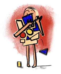
Software can do anything these days. Apps can run on devices as small as wrist watches. But when anything is possible, a difficult decision arises: Should the goal be to do more or to do things better?
Following a user-centered design process allows users to be involved, and their needs and goals to be identified early in the design process. This helps make the right decision about how feature rich your product should be. The goal of any business should be to help users successfully complete their tasks and benefit from using the product.

Usability is defined as the effectiveness, efficiency and satisfaction with which specific users achieve specific goals in specific environments. This refers to how quickly they are able to learn to use the product and how easy it is to remember, the efficiency attained while making use of the product, how error prone it is and the level of satisfaction users attain from using it.
Some companies believe adding as many features as possible to their product means more people will find it appealing due to its endless capabilities. But good products must be easy to use and meet user’s mental models. Too many choices can slow us down and complicate things, resulting in a poor experience.
“The time it takes to make a decision increases with the number of complexity of choices.”
Hicks Law
Chinese restaurant

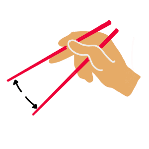
Take a step back and think about the last time you went to a Chinese restaurant. You were most likely faced with an infinite menu that took you a longer than expected time to read. You might have had a craving for noodles, but now you are faced with forty different noodle dishes. You spend time reading each noodle dish but you still can’t decide what to order, and at the end you decide to choose on the spot as the waiter asks for your order. Too many options causes “analysis paralysis” rather than liberation. With too many options to choose from, people find it difficult to choose at all.
An excess of choices mentally exhausts the individual who is faced with going through them all and comparing them before making a decision. Not only does this test an individual’s patience, but if they also have time constraints, it can lead to feelings of stress, frustration and abandonment of the process altogether.
Now let’s say your food arrived and it did not meet your expectations. Not only will this frustrate you, but you will also spend time ruminating on the thought that you made the wrong decision because you had thirty-nine other noodle dishes to choose from, and one of them would have satisfied you. This alternative makes you regret your choice and it also takes away from the satisfaction of having the choice to do it in the first place. The more options there are, the higher the chance of making an error. As the number of choices increase, so does the effort required to collect information and make good decisions.
Watch the paradox of choice TED talk below:
Choices and advanced capabilities can quickly make a product complex and in need of a manual to learn, this narrows down the audience that can and want to use it. However, advanced softwares are extremely useful for professional users as they help do complex, unimaginable things. A bit of training and learning is a small cost for the capabilities softwares such as 3D offer.
This is why it’s important to know your users, their incentives for using the product and their technical capacity. Pro software allows for slower learnability as the users often depend on it and their frequency of use is higher, and more usage allows for more time to learn, remember and adapt. But the complexity of the software should not merely depend on these factors, because challenging software can take away the satisfaction of learning it, even for pro users who have the technical ability. Imagine having to use a dissatisfying software everyday.
Who is it for?
For professionals, the absence of a single feature can lead to an inability to execute a task, but this is not an excuse to add every feature possible. Each feature implemented should be backed by research. Although this means more costs and resources, it is a marginally less risk than launching a poor product.

Expectations
We live in an era of instant gratification, often people don’t want to spend time and effort learning, rather they want to spend time doing, because this makes them feel they have achieved something. If the learnability of your product depends on its manual rather than intuitiveness, then you are creating something based on how you wish people would act, rather than how people act. By this I mean that you are expecting people to read the manual, when in reality we know that people often skip this part as they like to spend time doing rather than learning. Of course the learnability of a product depends on many factors but if the system is hard to learn and there are lots of alternative products out there, then it’s likely users will try to find a better solution elsewhere.
There are ways more advanced functionalities that can be introduced. Most companies offer different plans to guide users to the right level product, such as comparison tables.
To determine how much complexity you can afford in a user interface, you need to understand the people it’s intended for, their context of use, their motivations, goals, expertise, capacity with technology and their engagement level with the product.
This is where the importance of UX comes in. Personas ensure everyone knows who they are designing for, and this minimises chances of designing a Chinese Menu. Subjecting the majority of customers to unnecessary choices and complexities just to satisfy a few curious users or early adopters can frustrate the majority users of the system. You can’t always satisfy everyone, but around 80% of your users should be a good aim.
To conclude, our actions are ways to protect ourselves from fatigue and information overload. Every decision cost us time and effort, and we want to spend as little of both of these when making a choice. Too much choice undermines our innate cognition on how we process information efficiently. Keeping the number of features at an acceptable level allows users to make decisions easier with minimum amount of time and effort.
Takeaways
We strongly believe the aim should be to design with the end user in mind. Do better rather than do more is a good mantra in product design. Balancing out capabilities with ease of use results in a better outcome. Start by considering these questions:
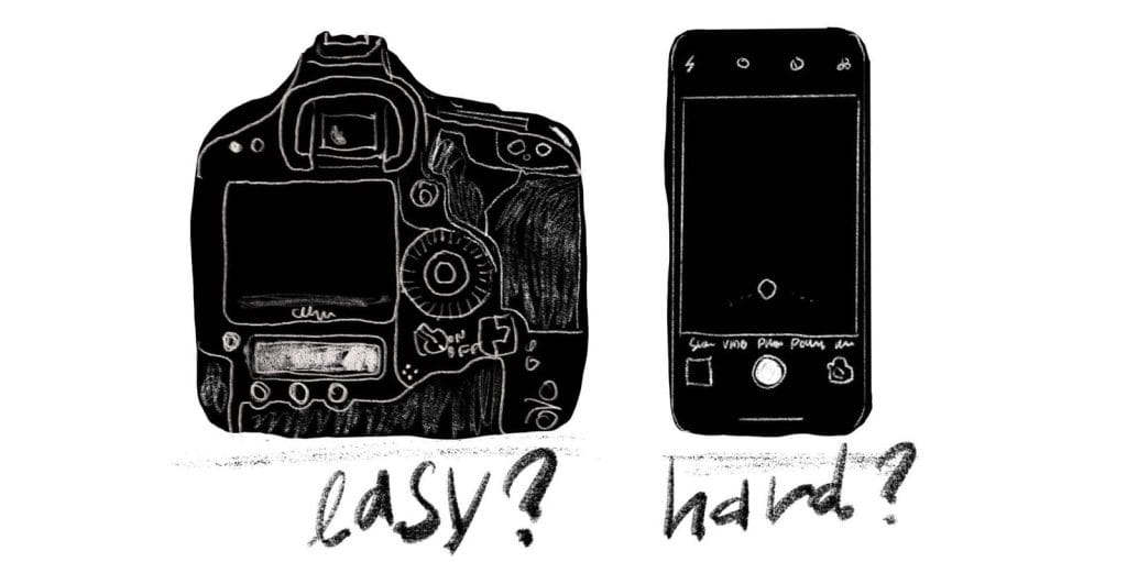
- Is it aimed at pros? i.e. Pro DSLR cameras. This allows for more functionality and complexity.
- Is it aimed at a broad consumer audience? i.e. Smartphone cameras. Simplify to make sure you meet the needs of most people in this audience, not experts.
Put the prototype in the hands of real users early on. Listen to them and iterate. If you follow this process, your chances for a successful product, happy customers and ROI will increase. People expect great usability and it is important to meet their expectations.
Source
https://uxdesign.cc/features-versus-usability-77f708486124

